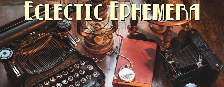
 For the last few months I'd been growing steadily bored of the title header on this particular Blogger template - it seemed a bit plain compared to the smart backgrounds and jazzy fonts of most other blogs I follow - so in the spirit of the new year and following a recent brainstorm of ideas for future posts, I've decided to change it. I think the new-look title works quite well - especially considering I'm still finding my way around Blogger, HTML, CSS and all that gobbledygook - although I can't promise I won't change it again if something else catches my eye. But I believe it captures the essence of the blog - what do you think? Not too obscure or detractive I hope?
Anyway, variety is the spice of life, so they say...


It looks electric from yesteryear, so I guess you're spot on! It suits the blog well. And Henderson: joy!
ReplyDeleteI like it; it's got a lovely sense of balance and suits the site content well.
ReplyDeleteIt definitely suits your blog. The writing on the buttons is intriguing – was one a till and the other a car?
ReplyDeleteI like it! Suits your blog very well too.
ReplyDeleteTups x
Loving the new look :)Been thinking of getting one of them meself.
ReplyDeleteVery very good header!
ReplyDelete